The year BEFORE the 2020 global pandemic, I dealt with my personal bout with the flu by using that miserable experience as inspiration to creating greeting cards. A series of Get Well illustrations danced and fluttered in my brain shortly after the endless need to throw up or go to the bathroom finally subsided. Figuring out the kind of illustrations to make, however, wasn’t as clear I hoped. My initial sketches were more surreal and offbeat. A friend of mine advised these unusual sketches may not be the best if I wanted to attract greeting card companies to buy my artwork. She suggested making cute, simple illustrations. I reluctantly agreed. Yet, in the back of my mind I planned on producing those surreal ideas in a different form.
A Few Months Later…
After receiving crickets from all the greeting card companies I submitted to, I steered my attention to creating more artwork and increasing my skills, which would fine tune my personal style. I eventually toyed with the idea of using Adobe Illustrator’s Gradient Mesh. Using this new tool (to me) was my way of unlocking my art from the limits of flat illustration. Being able to add more depth into my vector art suddenly wasn’t as far fetched as I staunchly believed and was eager to begin a new way of making more complex vector artwork. I knew exactly which artistic project would serve best with this new technique: the abandoned original greeting card sketches. The offbeat ideas were perfect to experiment with in a series I called “Fever Dream Dimension”. The name insinuated that these pieces were done under the influence of flu fever dreams.After receiving crickets from all the greeting card companies I submitted to, I steered my attention to creating more artwork and increasing my skills, which would fine tune my personal style. I eventually toyed with the idea of using Adobe Illustrator’s Gradient Mesh. Using this new tool (to me) was my way of unlocking my art from the limits of flat illustration. Being able to add more depth into my vector art suddenly wasn’t as far fetched as I staunchly believed and was eager to begin a new way of making more complex vector artwork. I knew exactly which artistic project would serve best with this new technique: the abandoned original greeting card sketches. The offbeat ideas were perfect to experiment with in a series I called “Fever Dream Dimension”. The name insinuated that these pieces were done under the influence of flu fever dreams.
Coming Up With The “Pill Refill” Concept
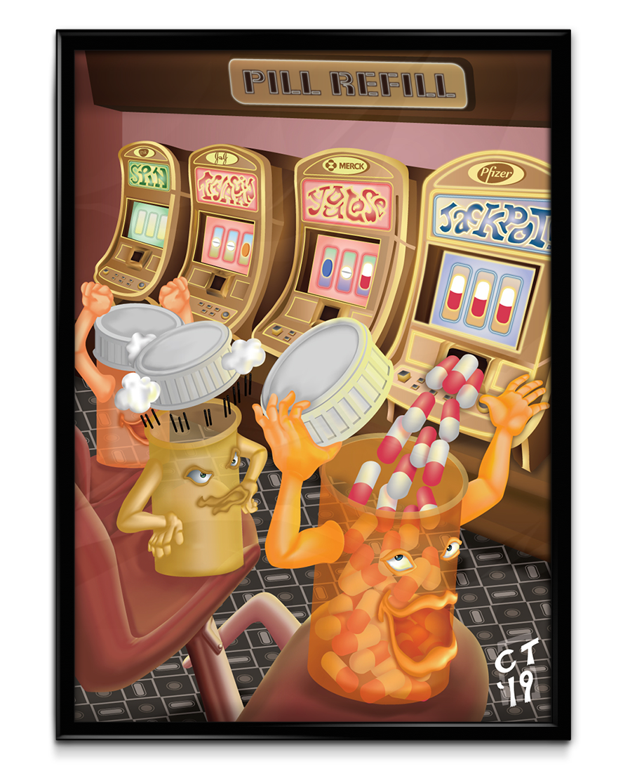
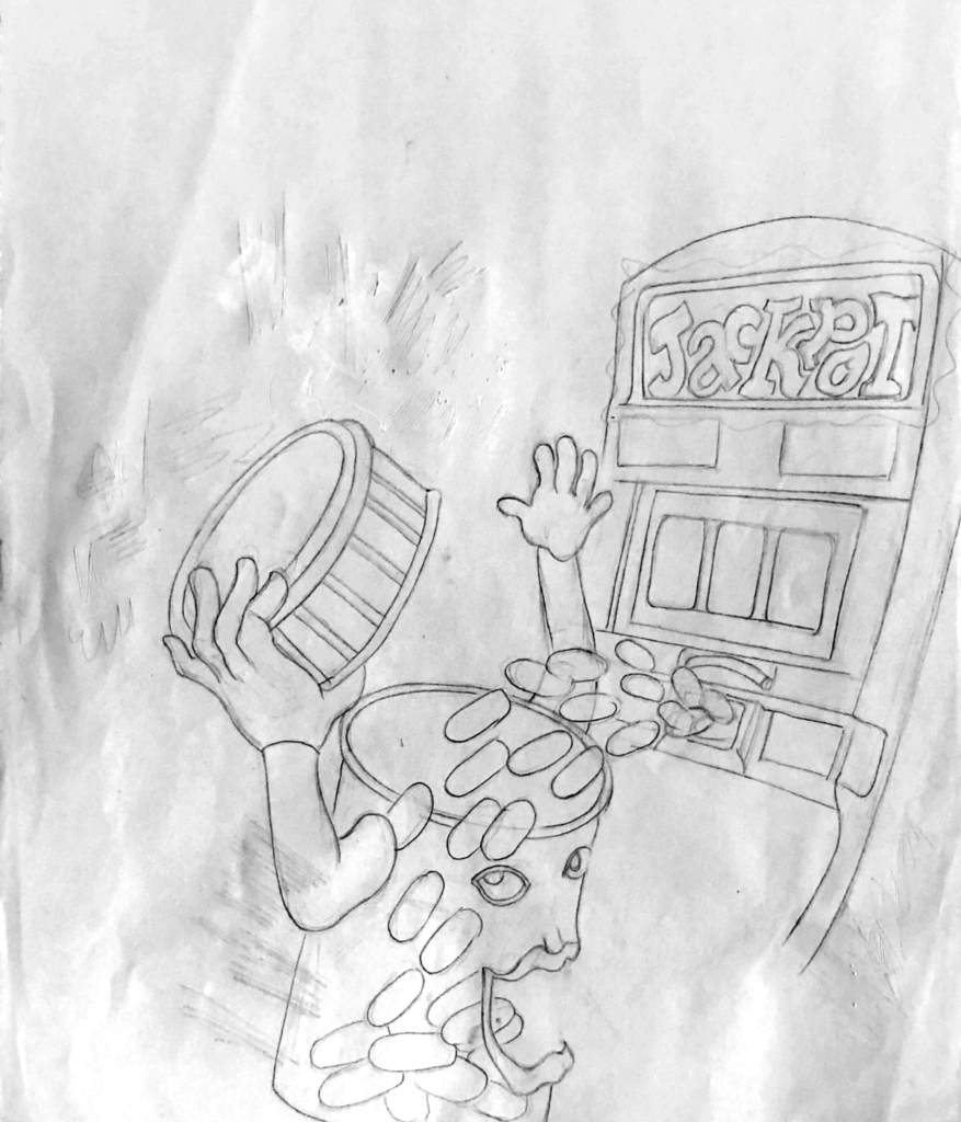
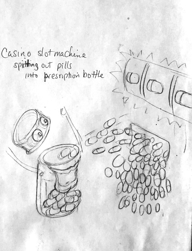
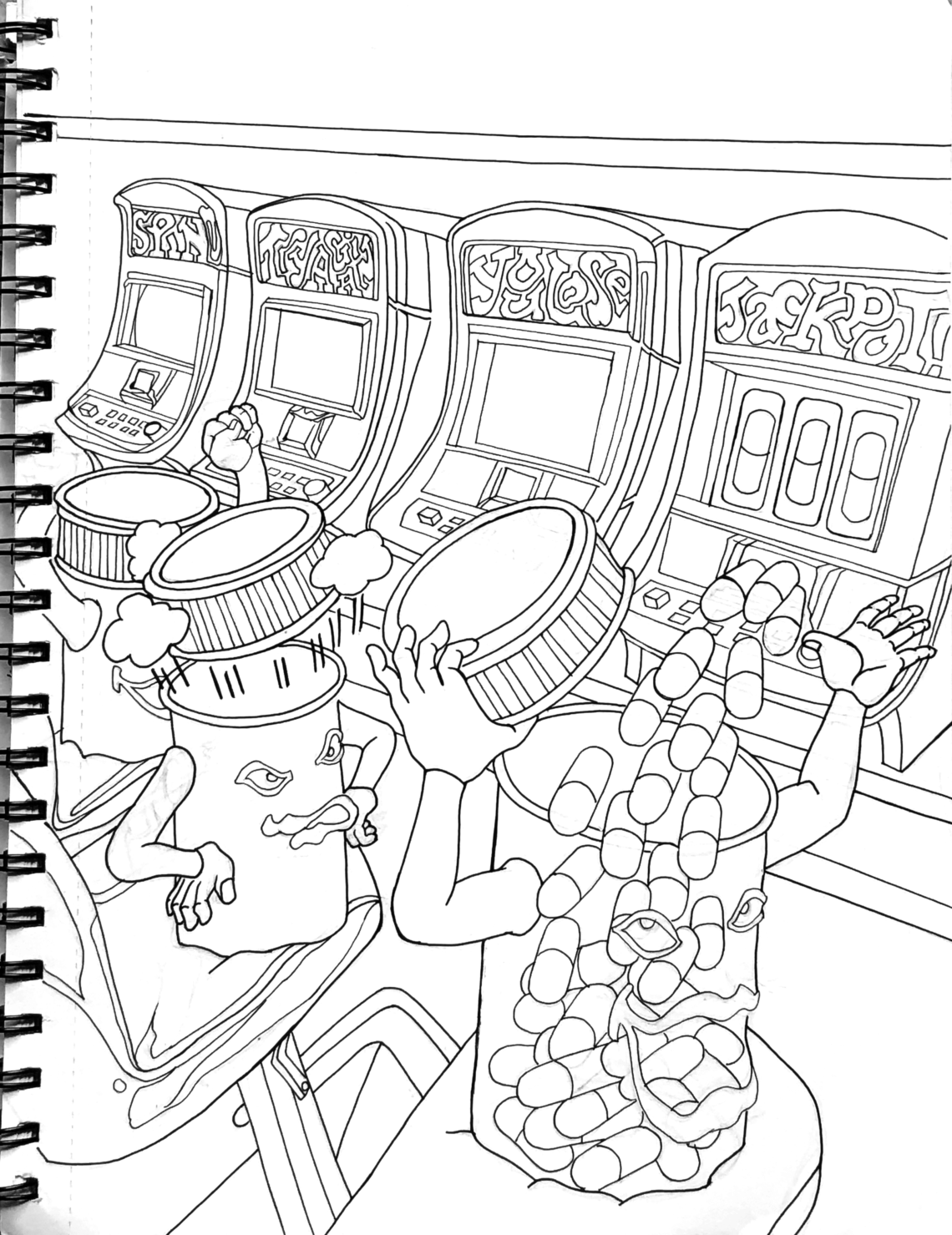
Out of the four “Fever Dream” pieces, the one I was most excited to work on was “Pill Refill”. When I drew the first sketch, I loved the concept of a prescription drug bottle being filled with pills after winning at a slot machine. After refining the idea, I stumbled upon the overall message commenting on the dilapidated United States health care system, especially the way people have to pay grossly inflated prices for their mediation. The concept became even clearer once I added the names of the pharmaceutical companies at the top of each slot machine. The poster was a visual metaphor which stated: The chances for affordable healthcare in the U.S. is as low as winning at a casino. The lucky prescription bottle prominently featured was all smiles, taking in all the pills, while the empty bottle on his left was steaming mad after he lost. The bottle on the far left cheered, holding onto the slimmest hope that what he just witnessed before his eyes was still a possibility. It’s an unusual commentary on the sad state of the American Health Insurance system.
Discovering A New Strategy With The Gradient Mesh Tool
Even though the Gradient Mesh tool has been part of Illustrator for years, it was the first time I ever thought about using it. I wasn’t aware I could achieve making more complex and realistic art with Illustrator. My mind was set with the popular industry conventions: To create art with smooth blends with color and opacity, use Photoshop; to make crisp, resolution independent, simple art, use Illustrator. Making complex vector art with depth was what I desired most, but it seemed unlikely to produce. Until now. The only way I could research how to use Gradient Mesh properly was hunting down a few YouTube videos I could find on the subject. Yeah, that’s how unpopular this tool is.
When I started the first piece in the “Fever Dream Dimension” series, I struggled to implement the techniques I learned from those videos. It’s not the way most artists create. The use of Gradient Mesh seems too cumbersome, mathematical and ridged. However, after some trial and error, even me, a person who is allergic to any math above basic Algebra, found a way to think beyond those restrictions. I slowly gained a system where I felt comfortable using Gradient Mesh and creating the desired results I pictured in my head.
The main difference between using the regular Gradient tool and Gradient Mesh is the grid. I’m one of those creatives who hates using grids. The thought of using them is as appealing as having my brain getting smashed into a wall. However, when I finished the first piece in the “Fever Dream” series, using grids felt less foreign. Molding them around more complex shapes became easier. I was beginning to shape a new approach in incorporating grids as part of my creative process.
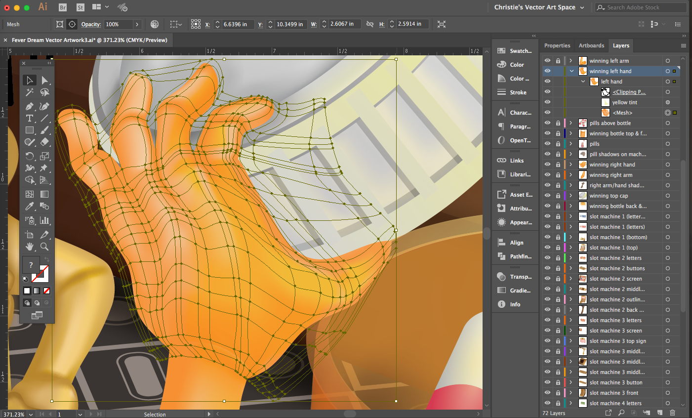
I strategized on which elements needed Gradient Mesh and which of them needed the regular Gradient tool. I handled every Gradient Mesh element the same way: Make a simple rectangle. Then add one horizontal and vertical line, which will convert the rectangle into a grid. The key factor in any grid is to imagine where the highlights and shadows will appear on a particular shape. After that, bend and twist each line accordingly. I became more comfortable using the grid handles; they are like the handles you see when using the path tool. Difference is, there are four handles to maneuver, not two. This adds more complexity and, admittedly, more confusion. The way to master the grid is to play around with its handles. If one (or more) of them go too far in any direction, it disrupts the smooth flow from one color to another. That’s why it’s important to start small; make a rectangle, add one vertical and horizontal line then build from there.
Using Transparency, Blending Modes & Appearance Panel With Gradient Mesh
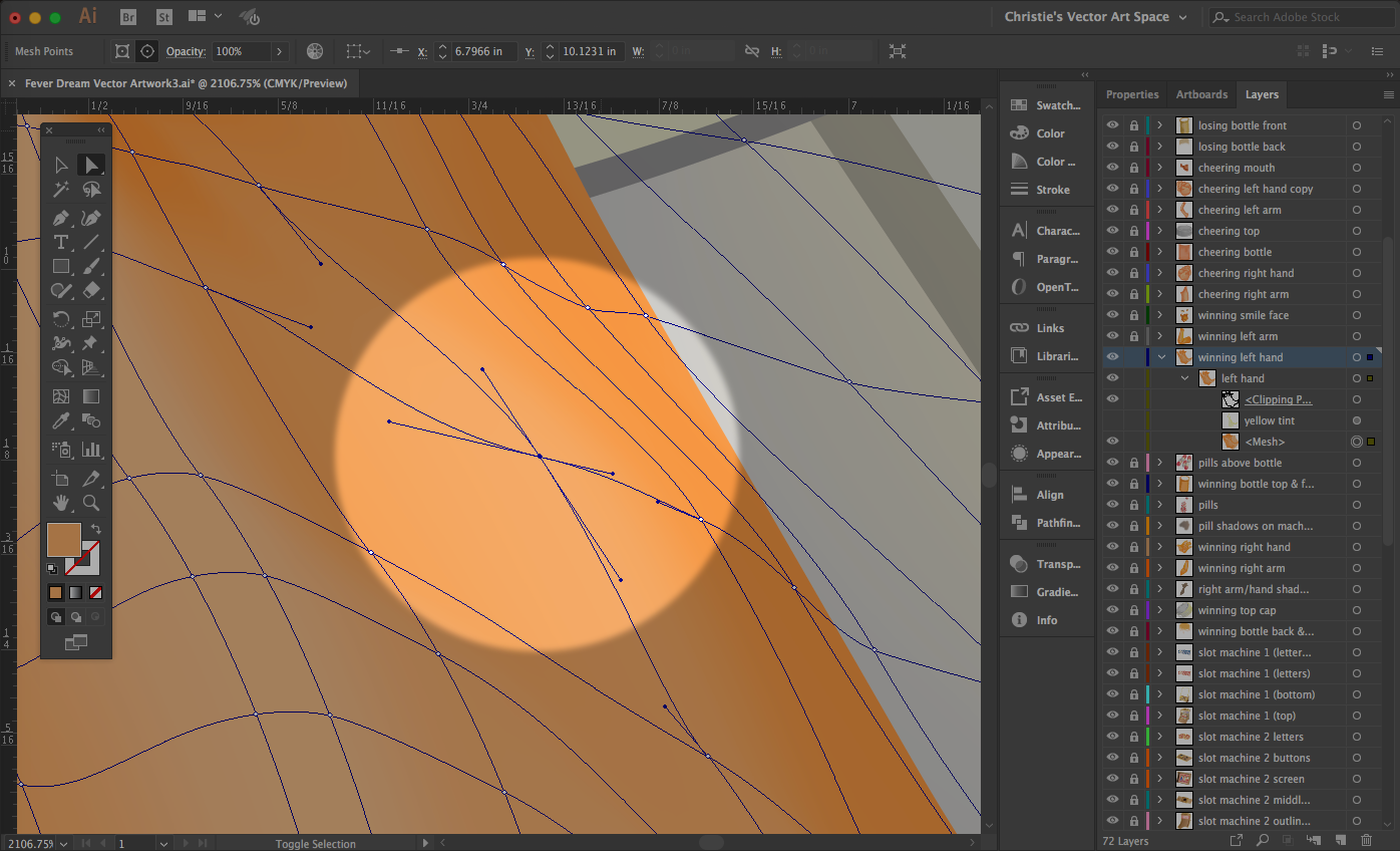
The transparencies you see with the prescription bottles are achieved with a combination of the Gradient Mesh grid, blending modes and transparency. After playing around with this tool more and more, I stumbled upon different techniques along the way. Not only can you manipulate percentages of color between each gradient point on the grid, you can do the same thing with opacity. This was my main technique with creating the translucent nature of the prescription bottles. The rim of each bottle was done using a combination of opacity and blending modes.
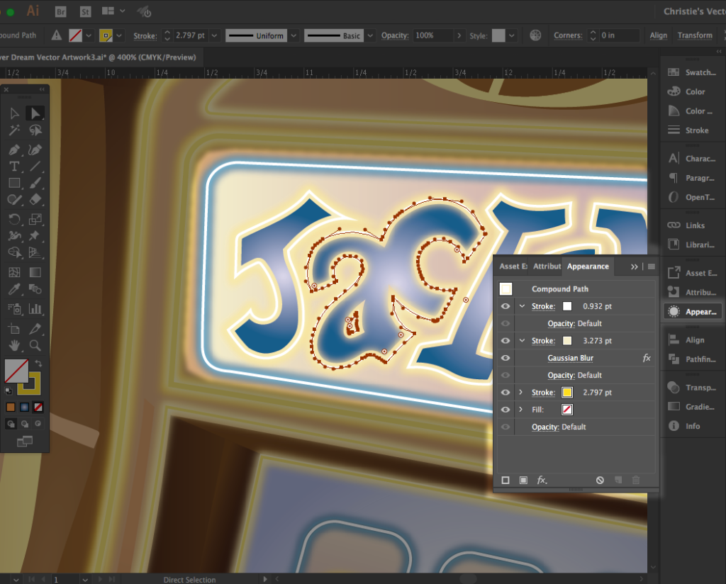
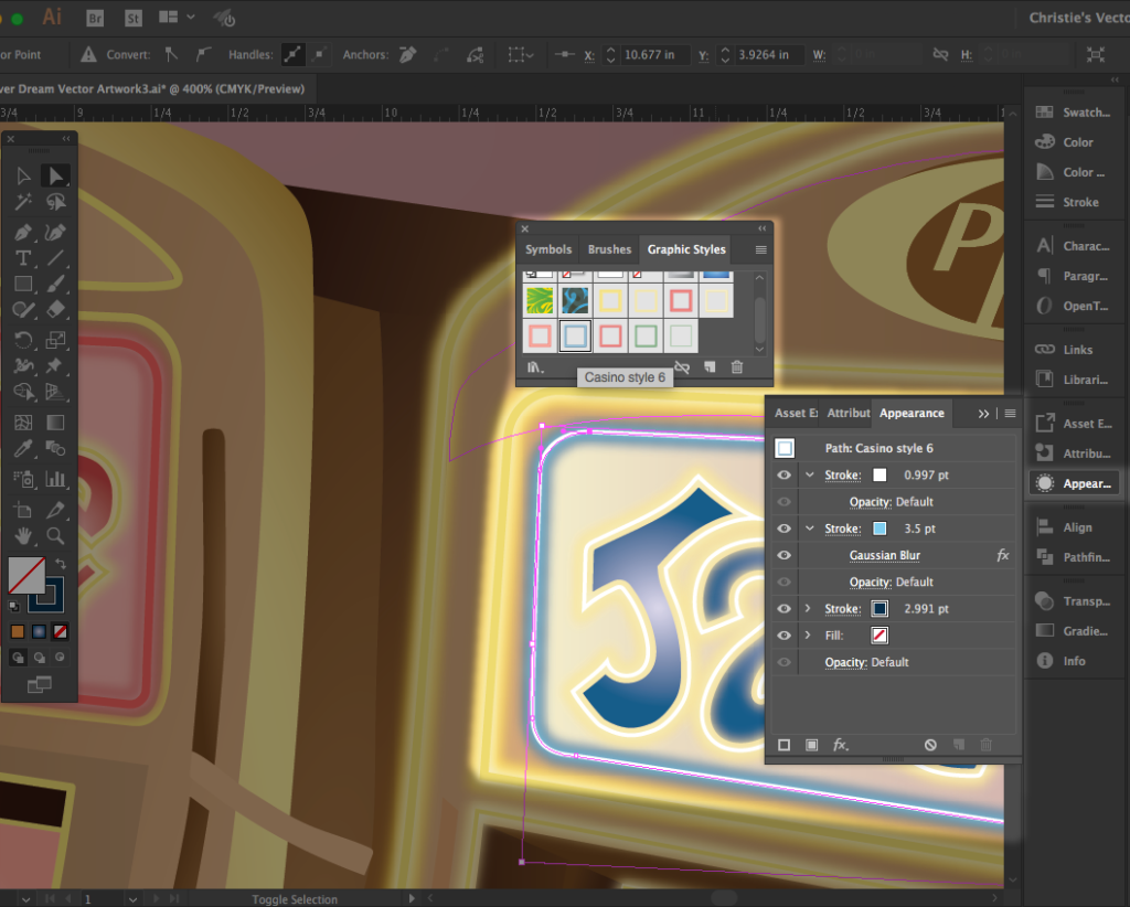
Another tool I’ve rarely used until creating “Pill Refill” is the Appearance Panel. Producing an outer glow on the slot machines and the words inside the upper portion of each machine would’ve been much more complicated and time consuming without the Appearance Panel. The flexibility in using more than two strokes on top of each other and adding a Gaussian Blur effect worked wonders. What was even more helpful was saving several versions of this appearance with the Graphic Styles Panel. Each time I needed the exact stroke effect on another area of the piece, I just clicked once and the effect was instantly applied.